This project is inspired by a small scandal in the city of Tartu, triggered by a story published in the daily newspaper ‘Postimees’ on January 31, 1905. In one of the articles from a series titled ‘Free Love,’ Jaan Tõnisson, editor-in-chief of the newspaper, mentioned the case of schoolgirls who, after participating in a meeting with Russian socialist students, engaged in liberal relations with the young men. In describing the story, Tõnisson used the term “brown-skirts,” directly referencing the uniform of Pushkin’s Girls Gymnasium in Tartu. This institution was one of the first secular schools accessible to young women at the time. The group of girls referenced in the article consisted of activists who were later expelled from the school due to their political involvement.
In the context of Tõnisson’s article, “free love” is portrayed as a kind of new trend, driven by women’s liberation and the spread of socialist ideas.
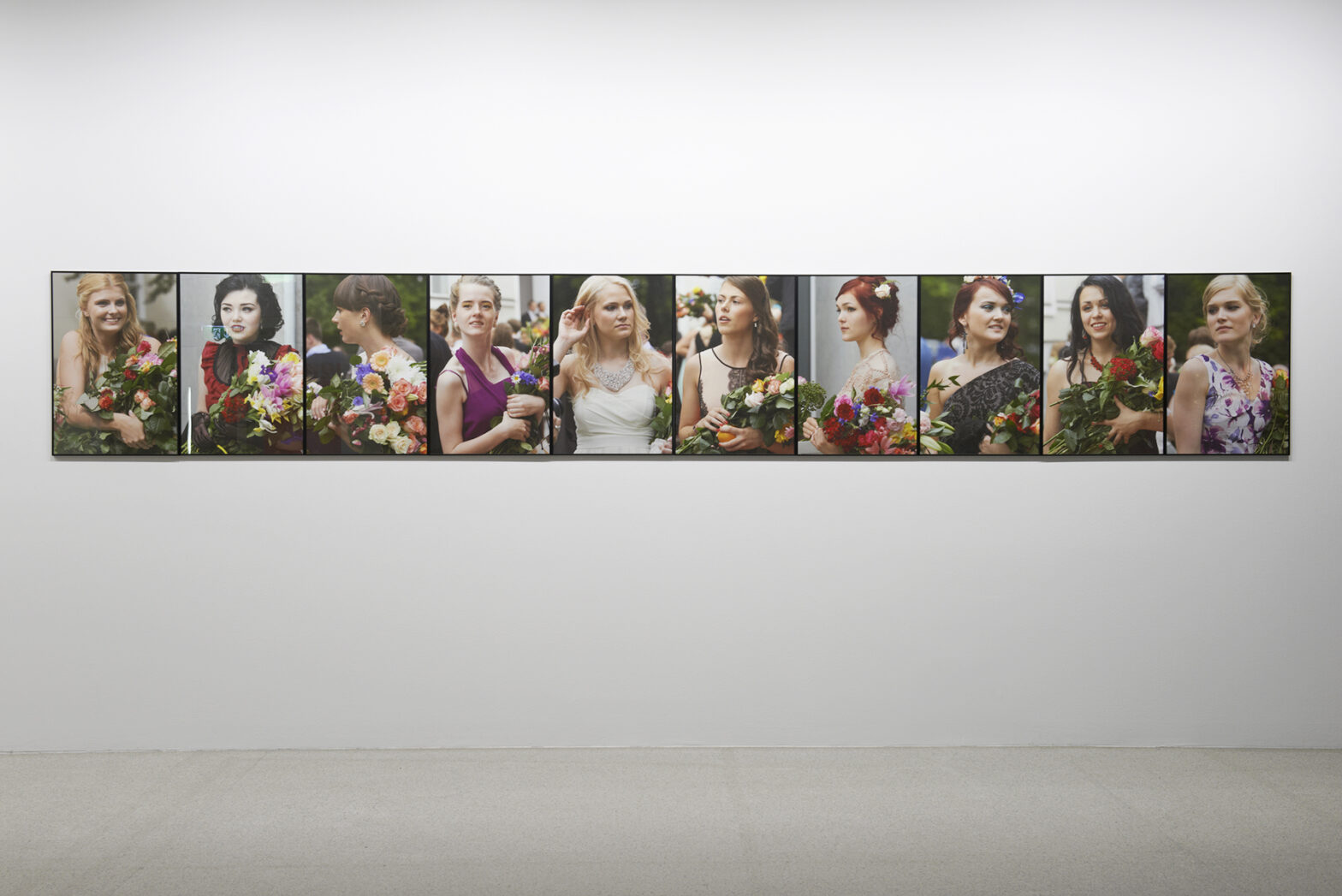
The work includes facsimiles of the original article published in ‘Postimees’, a vintage postcard depicting the school building of Pushkin’s Girls Gymnasium, and a photo panel depicting 10 female graduates at the graduation ceremonies of two gymnasiums in Tartu in 2013.