Ten Past Ten

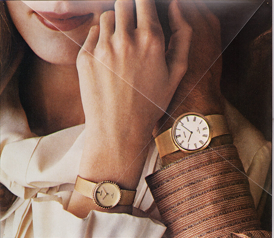
The images are appropriated from wrist watch advertisements depicting male and female hands. The original ads are mostly from magazines from the 1970s and 1980s. Most brands have set the time on their watches to 10:10, which is believed to have positive connotations of symmetry and victory. The watch hands placed on 10 and 2 frame the logo, which is usually placed on the upper half of the watch face. By removing logo and copy texts from the ads, the viewer is left with a pure photographic image. Hands, depicted up close, form a mise-en-scène where every detail becomes significant. Each pigment print has two intersecting folds, one according to the axis of the hand on the female watch, and another according to the axis of the hand on the male watch.

I Don’t Know You, So I Can’t Love You

Technical consultation: Aap Kaur Suvi

First shown in Riga Biennial of Contemporary Art (RIBOCA), in 2018, and developed further for the travelling exhibition Modern Love (or Love in the Age of Cold Intimacies), both curated by Katerina Gregos, the work explores possibilities of forming an emotional bond only through textual or aural interactions. Visitors can listen to a romantic conversation between two smart assistant devices, contemplating on digital love and longing. Photos in the installation are depicting a fragmented body emphasising the presence of voice and the absence of physicality.

Window Shopping

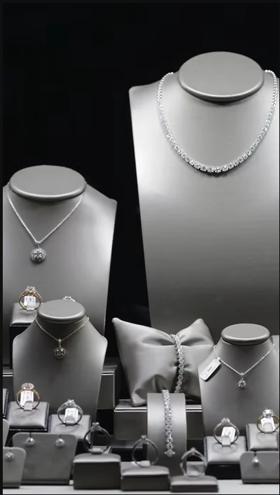
The series consists of photos of shop displays taken in Antwerp, Ghent, New York City, Vienna, and Tallinn, and of found and archival images of damaged storefronts. Show windows are located on the border of public and private space and the displays within have been compared with the genre of still life. In addition to their main function of attracting potential buyers, throughout their history shop windows have been targets for different political protests and criminal attacks.

Blonde

The work was commissioned for the permanent exhibition Landscapes of Identity: Estonian Art 1700–1945, at Kumu Art Museum, which focuses on the role of art in society and in shaping the identities of diverse communities.

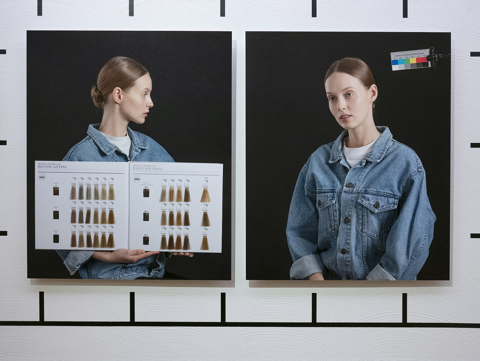
Blonde comments on the predominance of blonde, blue-eyed women in the visual culture of 1930s Estonia. On the one hand, this tradition goes back to the drawings of fair-haired Estonians by nineteenth-century artists and ethnographers; on the other hand, the tastes and preferences of the time were swayed by Hollywood with its platinum blonde actresses, especially Jean Harlow, who often featured in local newspapers.

Fair-haired and blue-eyed girls in traditional dress are portrayed in several pastels by painter Ants Laikmaa (1866–1942). In a way, these pictures bear a resemblance to the style common in the German art of the period, idealising rural lifestyle and racial purity.The central feature of the work is a double portrait of a young woman that is exhibited next to Ants Laikmaa’s pastel from 1937. The photographic diptych depicts the woman in profile as well as in three-quarter profile, a format inspired by nineteenth-century anthropological portraits and Kodak’s “Shirley Card” used in photo labs to calibrate skin tones during the printing process. Until the 1980s, films were calibrated against photos of light-skinned models, so that with darker skin colours, it was difficult to get the tone right. The added graphic elements—colour charts used in photography and beauty salons, a Munsell Soil Colour Chart, and hair dyeing instructions—highlight the important role that colour and calibrating systems play in the visual representation of people and, consequently, in shaping identities.

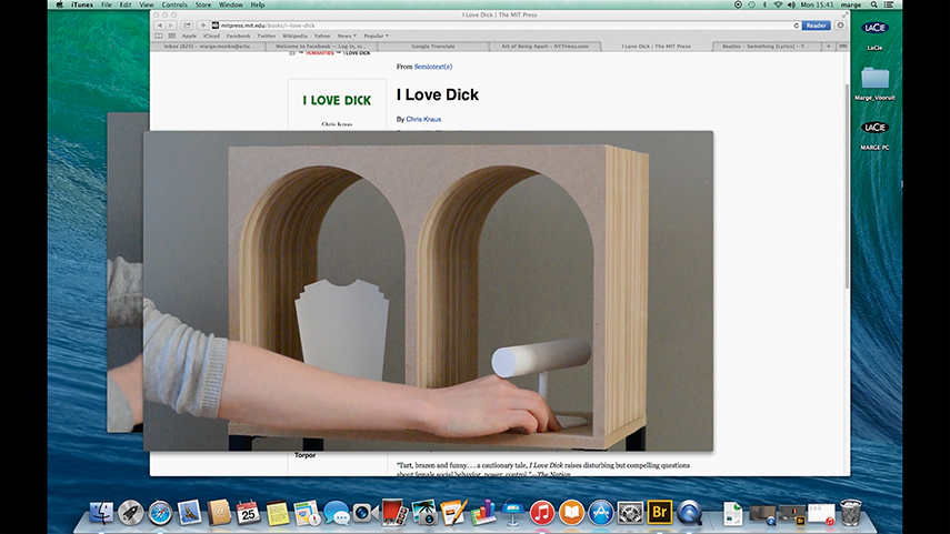
WoW (Women of the World, Raise Your Right Hand)

Text, production, editing: Marge Monko
Voice over: Anne Pajunen (ENG)
3D animation: Erik Heinsalu/BOP
Sound recording: Gregory Caron (ENG)
Sound editing: Jevgeni Berezovski

The point of departure for the video was the slogan Women of the World, Raise Your Right Hand used in De Beers’ advertising campaign in 2003. With this message the company, which until this day controls the majority of mining and distributing rough diamonds, was targeting the women who can afford their own diamond ring. The video consists of footage filmed in Hong Kong and Antwerp, 3D animations, print ads, and other found material.
The voice over text is focusing on De Beers’ marketing strategies through decades, the emergence of the famous slogan A Diamond is Forever, and the creation of a myth of diamonds as symbols of love and commitment.

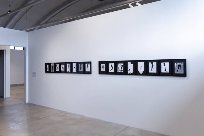
Untitled Photograms

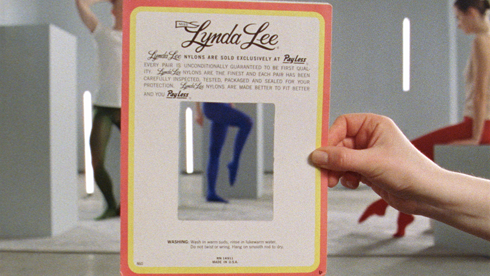
Made using the photogram method, these images present variations on graphic depictions of legs. The prints are made by using hosiery packaging that employ the cut-out shape of the leg as a design element. Placed onto photosensitive paper and then exposed to light, the packaging acts as a stencil, leaving behind a negative image. By presenting the photograms on a wall, the series creates the sense of a choreography of legs that reflect the different ideas of femininity and grace.

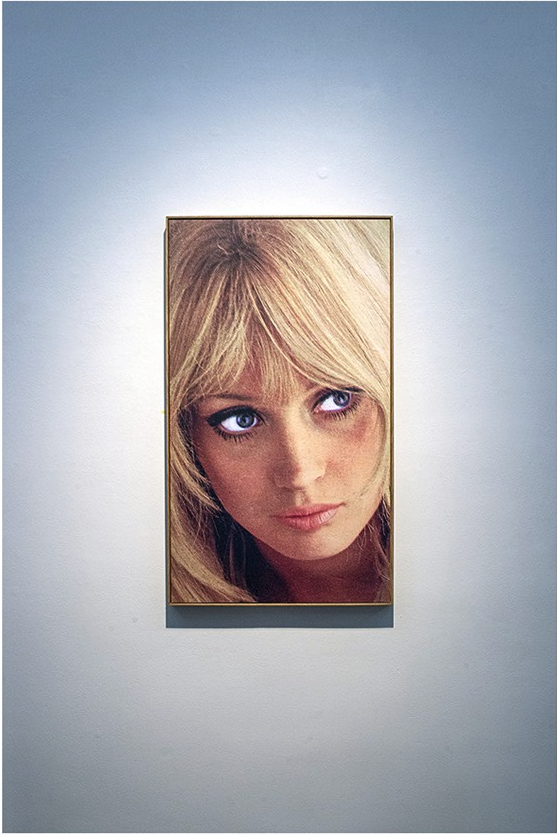
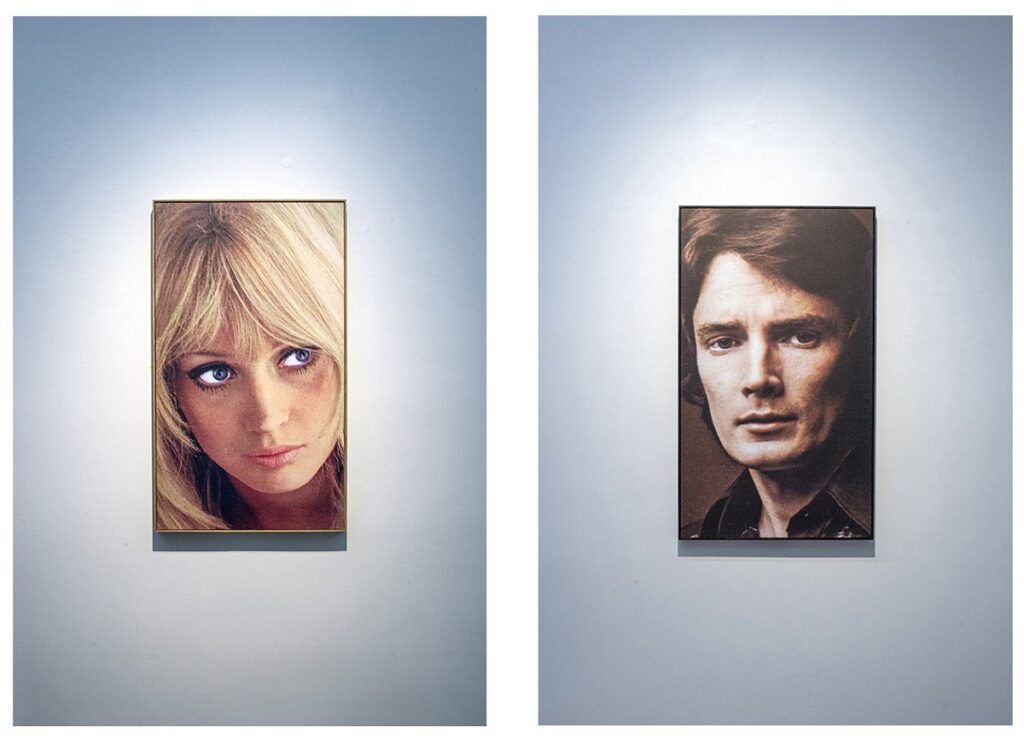
Nataša & Saša

These two portraits are appropriated from the packaging of perfumes (au de cologne) produced in the Soviet Union in 1970-80s, titled respectively Nataša (for women) and Saša (for men).
The models on the photos are rather Western-looking, a fact that implies the secret desire in the Soviet Union for attractive images related to capitalism.
The images are exhibited next to each other as portraits of lovers.